



![What Is a DST File? How to Open and Use It [2026 Guide]](https://dynamicmockups.com/wp-content/uploads/2026/08/what-is-a-dst-file-cover-768x403.png) Embroidery
Embroidery
On this page
What Are the Most Common Embroidery Digitizing Mistakes?
Your design looked crisp on screen. Then the machine ran it, and the fabric puckered, the edges frayed, and the fine detail turned to mush.
That is almost never the artwork’s fault. It traces back to the digitizing, the step where your image becomes the stitch data a machine reads.
The most common embroidery digitizing mistakes come down to seven:
- Too-dense fills: cramming in stitches until the fabric can’t cope.
- Ignoring stitch direction: flat, one-angle fills that gap and catch light wrong.
- Text set too small: letters that drop below the minimum stitchable size.
- Wrong color sequencing: a thread-change order that drifts and muddies.
- Skipping a test sew-out: trusting the file without proving it on fabric.
- Treating a cap like a flat rescale: shrinking a flat design onto a curved surface.
- Trusting a render alone: letting a pretty preview stand in for real stitches.
Every one of these embroidery design mistakes shares a root cause. You are judging the file by pixels on a screen instead of by how thread behaves on cloth.
Thread has weight. It pulls, it piles up, and it reflects light in ways a flat PNG never will.
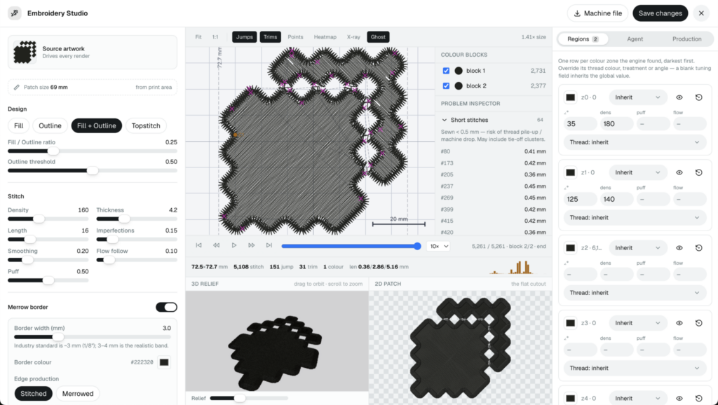
So this guide pairs each preview with what it actually sews into, and shows you how to catch the problem before you thread a needle.
Let’s get into the seven.
Density and Direction: The Mistakes That Make Fabric Pucker
Mistake 1: Too-dense fills. More stitches feel safer, so beginners pack them in tight. The machine then punches so many needle holes so close together that the fabric can no longer hold its shape.
The result is puckering, the bunched, wavy ripple around a design that refuses to lie flat. Push the density far enough and you also get embroidery thread breaks and needle holes that stay visible after the run.
Under-stabilization is the classic partner to a dense file. And the stretchier or denser the job, the more support it needs.
So if you keep asking why does my embroidery pucker, start with the file, not the machine. Cut the stitch density so the fabric can breathe, add the right underlay, and match the fill to the weight of the cloth.
Underlay is the quiet fix for most embroidery density problems.
Match the underlay to the job. A light zigzag or edge run steadies satin columns, and a tatami underlay braces large fill areas.
Then let the fabric decide the top density. Light fabrics want less, structured or heavy fabrics can take more, and one setting for every garment is how you end up re-sewing.
Mistake 2: Ignoring stitch direction. A fill sewn at a single flat angle across a whole shape looks lazy in thread even when it looks fine on screen. It gaps at the edges, and it reflects light in one hard sheet instead of following the form.
Thread has a sheen, and the angle you sew it at decides where that sheen lands. Vary your stitch angles so the stitches follow the contours of the shape, and the light will curve with them.
That is the gap between a logo that looks molded and one that looks flat and cheap. Direction costs you nothing but attention at the digitizing stage.
💡 Pro Tip: Before you commit a single stitch, run the density heatmap over your file. It shades the danger zones where stitches crowd together, so you can thin them out before the needle ever finds them.
Text and Color: The Mistakes That Turn Clean Art Into Mush
Mistake 3: Text set too small. Type has a floor in embroidery, and it sits higher than most people expect. Below a certain size the strokes crash into each other and every letter fills in as a solid blob.
How small can you go? Custom-patch digitizers put the minimum height for readable lettering at around 5 mm, and recommend at least 8 mm, with 10 mm or more for unusual or delicate fonts.
There is a stroke rule underneath that one. Hand-digitizing guidance is that no letter stroke should be thinner than about 1 mm, or the column will not hold together.
The fix is not glamorous. Respect the minimum height for the stitch type you are using, simplify a fussy font into cleaner strokes, or bump the whole thing up a couple of millimeters.
This is the one mistake software can only partly save you from, so hold on to it. We will come back to why tiny text is the genuinely hard case at the end.
Mistake 4: Wrong color sequencing. The order your machine changes thread in is part of the digitizing, not an afterthought. A careless order sends the needle jumping back and forth across the design, and every jump is a chance for the fabric to shift.
That shift shows up as registration drift, where colors and outlines stop lining up and the edges go blurry. A messy order also adds trims you did not need and lets layers overlap into muddy patches.
Sequence colors to make as few thread changes as possible, and stack your layers so each one sits where it should. Digitizing pros describe the goal as a clean sequence that minimizes trims and prevents registration issues.
Both of these mistakes leave fingerprints in the stitch file. A problem inspector reads that file and flags the too-short stitches that jam the needle and the too-long stitches that snag, so you spot trouble before a single color runs.
Skipping the Reality Check: Sew-Outs, Caps, and Render-Only Trust
Mistake 5: Skipping a test sew-out. The screen can lie. The garment cannot.
An embroidery test sew-out is a sample stitched on the same fabric you plan to use for the batch. It is the only thing that proves the density is right, the letters are readable, and the colors register.
Skip it and you find the flaw on unit 1 of 200, after the thread and the blanks are already spent. Sew one sample first, on the exact garment and color you will run, since fabric weight and weave change how the same file behaves. It is the cheapest insurance in the shop.
Mistake 6: Treating a cap like a flat rescale. A design that sews perfectly on a flat tote falls apart when you shrink it and drop it onto a curved, structured cap. The surface is different, so the stitching has to be too.
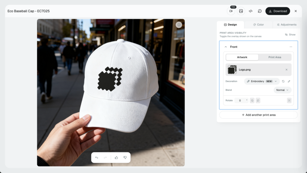
Curved caps and 3D puff need their own push-pull compensation, the deliberate widening and repositioning that counters how thread distorts as it sews. They also need the right start point, usually center-out, so the design holds its place on a panel that fights back.
3D puff adds its own rules on top: keep the satin columns wide, drop the tiny text, and ease the sharp corners so the foam sits under thread instead of poking through.
Digitize for the specific product. A cap is its own job, not a smaller version of a tee.
Mistake 7: Trusting a render alone. A glossy 3D preview is great for a product page and dangerous as a proof. It can hide the exact density and registration problems that ruin the sewn piece.
Treat a render as one input, not the final word. Pair every preview with a real sewn result and a machine file you can open and inspect.
That machine file matters because it holds the stitch data itself. If the format is new to you, here is what a DST file is and why it is the thing your machine actually reads.
How Dynamic Mockups Helps You Catch These Before You Sew
This is where we come in. Dynamic Mockups created the first AI agent digitizer called Stitch and added an embroidery decoration method so you can see a stitched result long before you commit thread to it.
Upload your PNG, and we convert it into a photorealistic embroidery preview you can drop onto any product mockup. It is free, and there is no credit card required.
The preview is only half the value. The diagnostics behind it are the other half.
Our density heatmap shades the areas where stitches crowd together, so the puckering and thread-break zones from Mistake 1 show up as color instead of as a ruined garment. The problem inspector reads the file for too-short and too-long stitches, the same signals behind poor sequencing and collapsing detail.
Together they let you fix density and direction on screen, before you waste thread on a run that was never going to work.
We built the advanced Embroidery Studio editor and Stitch AI agent to act like a professional embroidery digitizer with expertise and creativity, and not an anonymous converter that spits out a file and disappears. You can adjust the design, watch how the change reads in stitches, and export a clean machine file you can download and inspect.
So most of the time you don’t have to worry about making these mistakes when using Dynamic Mockups Stitch AI agent because he is taking care of everything.
That is the difference between a tool you can question and a black box you can to trust on faith.
Ready to try? Create an account and convert your artwork to an embroidery file.
When your embroidery preview passes, pull it onto real gear from our library of free mockup templates, and you walk away with a listing image and a sew-ready file from the same session.
The Hard Truths: Tiny Text and Why a Sew-Out Still Wins
Two honest caveats, because you deserve them.
Very small text and fine detail are still the hardest case in embroidery, and no software fully solves sub-minimum lettering. If your text drops below the readable floor, a preview will warn you, but it cannot rewrite the laws of thread. Sometimes the only fix is a bigger size or a simpler font.
And a preview de-risks a file. It does not certify it.
Nothing replaces a real sew-out on the actual fabric, because thread, tension, and stabilizer all get a vote that no screen can count. The job of a good preview and a problem inspector is to catch the many mistakes that are cheap to catch early, so your one physical sample becomes a confirmation instead of a coin flip.
That is the whole of these embroidery digitizing tips in one line. Use previews and inspectors to kill the obvious problems on screen, then confirm the file with thread.
Check your next design for free before you sew it.
Keep learning: if you want the preview to sell as well as it proves, see our roundup of the best embroidery mockup generators.
Showcase your E-commerce products like big brands, without costing a fortune.
Sign up today. No credit card required. →
Frequently Asked Questions
Why does my embroidery pucker?
Puckering almost always starts with the file rather than the machine. Too-dense fills punch needle holes so close together that the fabric can no longer hold its shape, and inadequate stabilizing makes it worse. Cut the stitch density so the cloth can breathe, add the right underlay for the job, and match the fill to the fabric weight.
What is the most common embroidery digitizing mistake?
Cramming in too many stitches is the classic one. Beginners assume more stitches feel safer, so they pack fills tight until the fabric cannot cope, and the result is puckering, thread breaks, and visible needle holes. Under-stabilizing usually rides along with it. Ease the density, add proper underlay, and let the fabric weight decide how many stitches it can hold.
How small can embroidery text be before it stops reading?
Most digitizers put the floor for readable lettering at around 5 mm tall, and recommend at least 8 mm, with 10 mm or more for delicate or unusual fonts. There is a stroke rule too: no letter stroke should be thinner than about 1 mm, or the column collapses. Go below that and letters fill in as solid blobs. Size up or simplify the font.
Do I still need a test sew-out if the digital preview looks perfect?
Yes. A preview de-risks a file, but it does not certify it. Thread, tension, and stabilizer all get a vote that no screen can count, and fabric weight and weave change how the same file behaves. Let previews and inspectors kill the obvious problems early, then sew one sample on the exact garment and color you will run. Your physical sample becomes a confirmation instead of a coin flip.
Can a bad embroidery digitizing file be fixed, or do I need to redigitize?
Often it can be fixed. Density, stitch direction, and color sequencing all live in the stitch data, so an editor and diagnostics like a density heatmap and problem inspector can thin crowded areas and reorder colors without starting over. The exception is text below the readable floor. No edit rewrites the laws of thread, so sub-minimum lettering usually means a bigger size, a simpler font, or a redigitize.
![How to Make an Embroidered Hat Mockup From Your Logo [2026]](https://dynamicmockups.com/wp-content/uploads/2026/08/embroidered-hat-mockup-cover-768x403.png)